Medella Therapy Center
The purpose of Medella Therapy Center is to provide bilingual-bicultural mental health services, address the stigma of mental health in the Latinx community, and provide affordable services to people who are uninsured. Medella center serves the Portland metro area. Services include: Bilingual ( English/Spanish) individual counseling for people who are struggling with trauma, depression, anxiety, and relationship problems.
Art Direction / Logo / Brand Design / Illustration
The Problem
Stand out to a demographic who predominantly do not seek or believe in mental health. Latinx community generally tend to not really believe in mental health so the challenge was creating a brand that they would be more in tune to their values as well as standing out from other mental health services in the area.
Strategy & Moodboard
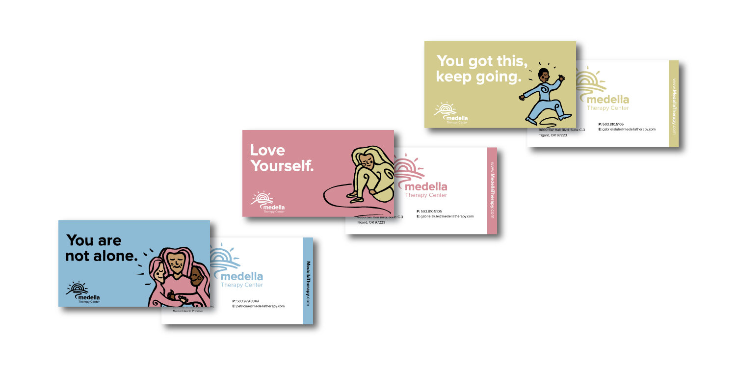
Therapy Centers and healing spaces share similar color palettes and general aesthetics. This brand differs in both to make Medella Therapy Center stand out and appeal to the Latinx community with low means to good therapy. This community generally has difficulty finding adequate mental health centers because they seem to “expensive”. The reason being that these centers use stock photography portraying upper middles class families and people which disconnects visually from this particular group. This brand strategy aims to break this barrier by using illustrations and simple color palettes to give a more approachable feel to this organization and in turn reach its target audience more effectively.

Un Dia a la Vez
One day at a time concept is based on the the process of healing. To represent this, the sun cycle is inspiration for the progression of time. The sunrise and sunsets are both landmark events in this process and visually look similar. This paved way for the development of the logo that will serve this organization.
Logo
The logo is inspired by the sunrise and sunset. It is hand drawn in a line style with soft lines and organic curves to evoke a friendly feeling. The sun, being a powerful sign throughout history carries its power and spiritual connotations that will resonate with the target audience. “Medella” is hand lettered to connect with the logo more effectively and in lowercase to keep the friendly feel that lowercase letters naturally have. “Therapy Center” is typeset with the organization typeface in a lighter weight and in sentence case to give a professional feel to the organization.
Color Palette
CMYK: 54, 0, 42, 0
RGB: 115, 199, 170
HTML: #73C7AA
CMYK: 44, 26, 2, 0
RGB: 141, 168, 212
HTML: #8DA804
CMYK: 2, 20, 48, 0
RGB: 248, 206, 145
HTML: #F8CE91

Typography
Proxima Nova is a typeface that is both friendly and eye catching. It can be used as headline in bold weight and also as body copy for the organization’s needs. The big x-height and short ascenders and descenders are make it legible as small sizes which make it more flexible to further meet the organizations needs. In promotional products, such as fliers, posters and business cards, the headline type will be hand drawn and paired with Proxima Nova for body copy. The hand drawn type will connect with the logo and illustration aesthetic.


