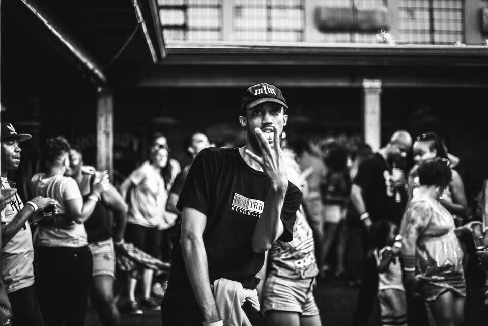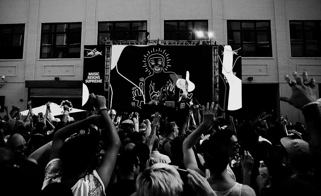
“It’s not just a party, it’s about community.”
Art Direction / Logo / Brand Design
YGB: Young Gifted and Black/Brown


Mission Statement
YGB’s mission is to create spaces of joy and healing for the Black and Brown community of Portland OR. Our collaborative is Pro-Black, Pro-Femme, Pro-Queer and centers those identities at every event. We believe that liberation will come from art, self-love and community.
Brand Strategy
Community is a big part of Y.G.B. and this led to the concept of bringing people of different backgrounds together to create a community through parties and social gatherings. Y.G.B. operates by being fluid and not having a physical space so it is able to create these places of healing almost anywhere and thus emphasizes the importance of the people who participate in these events.
Members of the community create unbranded content for Y.G.B. mainly because it lacks visual brand. However, the collaboration of artists is what gives Y.G.B. a unique aesthetic and should not be removed from the new brand but rather integrate it non-intrusively but also be recognizable amidst the city landscape.
The solution is bright colors and gradients integrated with the shapes of the logo in various forms to represent the dynamic nature of Y.G.B. This framework also allows the artists’ work to really drive the visuals with minimum parameters to fully experience the energy of the Y.G.B. community.
Logo
The logo is based on the abstraction of the Y.G.B. letters. The new logo represents the coming together of people of different backgrounds to create a community that is Y.G.B. Portland.
The bright colors pay homage to the richness of cultures of the people that make up the Y.G.B. community as well as pop in the predominantly grey toned city landscape that serve as Y.G.B.’s parties and events. “Portland” is set in the brand typeface Druk to contrast to the organic shapes of the Y.G.B. mark.
Typography
Y.G.B. is a community of artists, musicians, dancers and creators. This gives the organization a very unique aesthetic. Typographically, it should be connected throughout its various parts of the organization as well as bring energy through type as well.
Druk is selected as the organization’s typeface to use throughout. Druk has a character that brings attention to itself through its wide typefaces and condensed versions for dynamic type layouts to satisfy the organization’s needs.
Color Palette
The colors are designed to be bright and colorful. They are aimed to capture the bright spirit of Y.G.B. and its energy. The primary colors include a warm, tropical gradient to represent the warmth of the community that Y.G.B. embodies. The secondary gradients are included to evoke additional feelings depending on context without the need to change the entire logo color palette.
Member Content
Member content has little to no branding. This is intentional so that the contributing member feels free to express themselves with little to no parameters. By leaving this option open, members feel part of the Y.G.B. community
Typographic
Posts that are type driven should use the brand typeface and brand colors in any scheme deemed appropriate to convey the message correctly.
Branded
Heavily branded content is geared towards merchandise sales and major promotions. This helps drive sales and generate revenue to continue helping the BIPOC community.
The combination of these three styles of social media content, allow Y.G.B. to continue being a venue for people to come together to heal and express themselves and also establish a unique brand that will be easily recognizable to the community.


